Lightroom's New Variance Slider for Infrared Photography
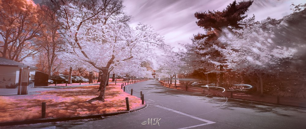
Image after using the new variance slider
It’s techtober and with it comes the releases of new updates and gear to fuel our hobby / obsession. Adobe is no exception, and today marks the release of the new version of Adobe Lightroom. As always there is a plethora of new features and updates that promise to change the game! Let’s face it they employ huge resources to “communicate” with us, so that we continue to pay them. But is there anything to get excited about? Well I think there is, and it’s the Variance slider.
“With new features and updates that promise to change the game as they always do, is there anything to get excited about? I think there is, and it’s the Variance slider”
One of the challenges I have always found about shooting infrared images, is extracting as much detail as possible from the image. This includes bringing out the micro tonal and colour detail that lie inside the RAW files we capture. To do this we build and us custom profiles, we spend hours learning and using tools and practices we are provided to craft the final image. There are so many tools that can do this and as much tribalism as usual about which one is better. But in the end we want beautiful nuanced images.
A few years ago adobe brought in the point colour tool in Lightroom to help with this, and this was a huge step forward. This tool allowed us to either use this as a global or a local adjustment. Through it we could target individual colours, adjust them and finesse the final colours. But there were limits which we discovered quickly, with developing and extracting, the teasing apart of similar colours to capture the subtleties of the scene we are capturing.
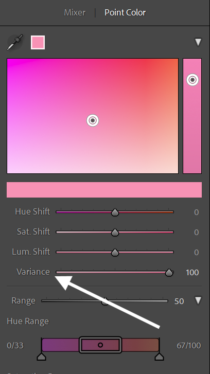
The new variation slider in the point colour tool
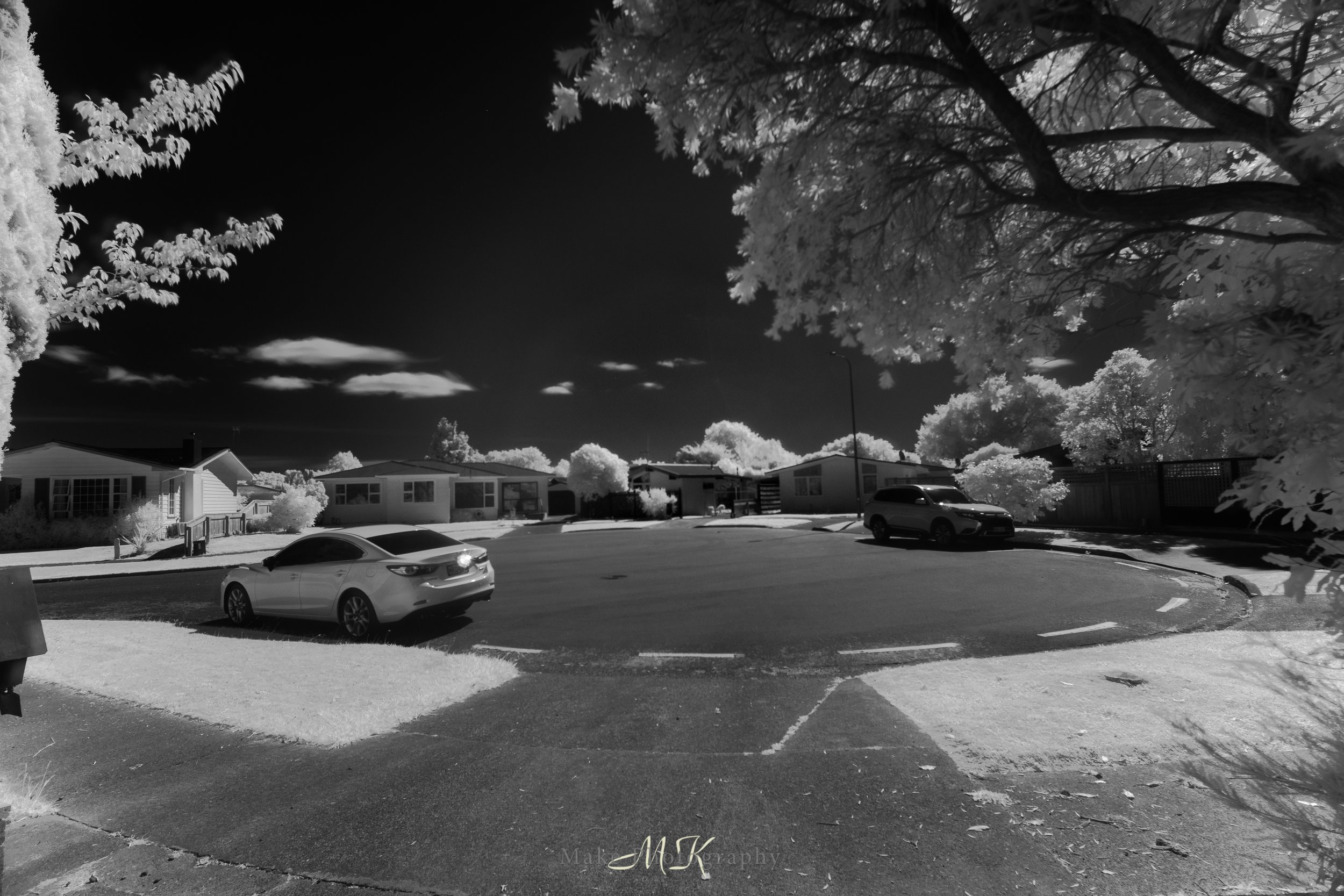
With the new variation slider shown above, we now have a control that can separate those similar colours. In the image below you can see the difference has made. Some of the pinks remain but others from the original image have been migrated between pinks and apricots, making the image far more interesting. This is going to be a really interesting tool to explore further. If you look at the image you can see how the colour reflected changes in the shadows, an interesting detail missed in the earlier processing.
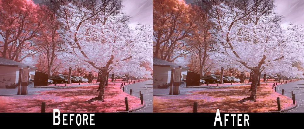
Note in the after image how some of the pinks have been migrated to a more apricot colour
Let me know how you get on and share the images you create with it, I am interested to see what people achieve with this. I am interested to see how this will also effect the black and white processing built from images processed like this. As we all know in the digital workflow the best black and white conversions are made using the best colour developed images, this is because the more colours we have, the more tones we can extract in the black and white conversion.

With the new variation slider shown above, we now have a control that can separate those similar colours. In the image below you can see the difference has made. Want to know more, click on the link to see more